上へ、上へ Upward and onward
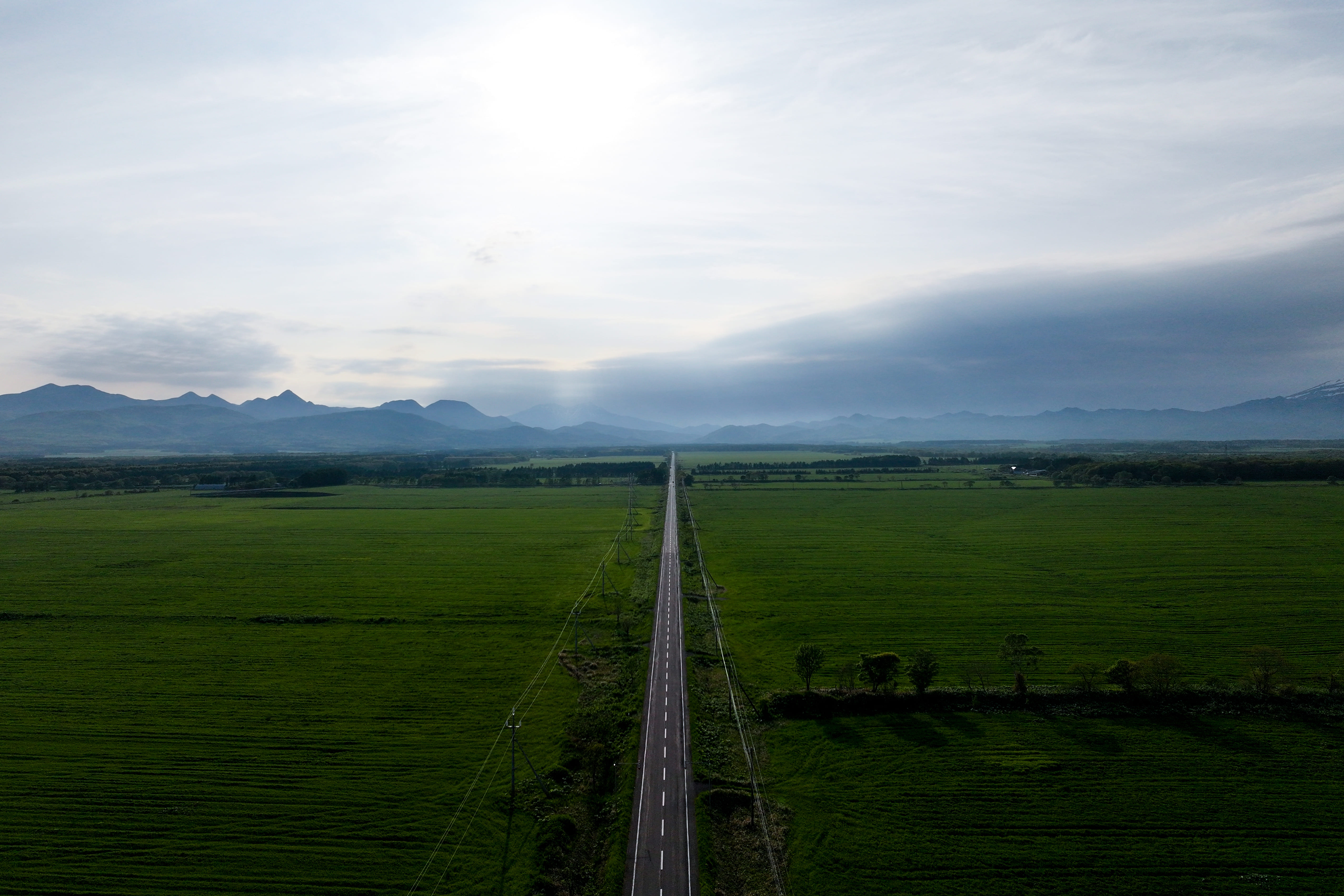
北海道・標津町。
農耕馬が土を踏みしめていた昭和20年代、この地の酪農は大きな転換期に立たされていた。
増える乳牛、足りない給餌。声にならない不安に、ひとりの男が静かに火を灯す。
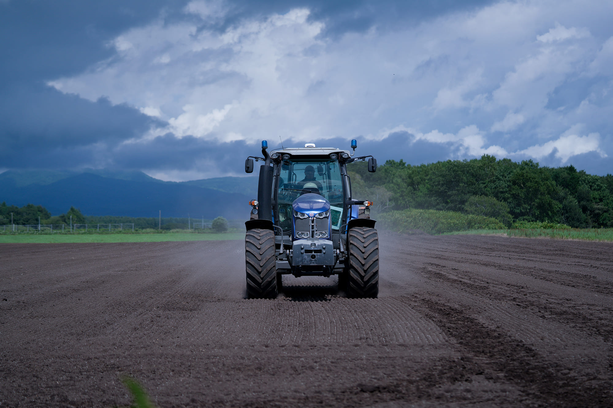
初代・上田景光。昭和29年、たった一台のブルドーザーから上田組は動き始めた。
昼夜交代制で24時間重機を稼働し、荒地を切り拓き、地域とともに未来を押し進めた。
其れは、“技術”ではなく“信念”で大地を動かしていたのだろう。
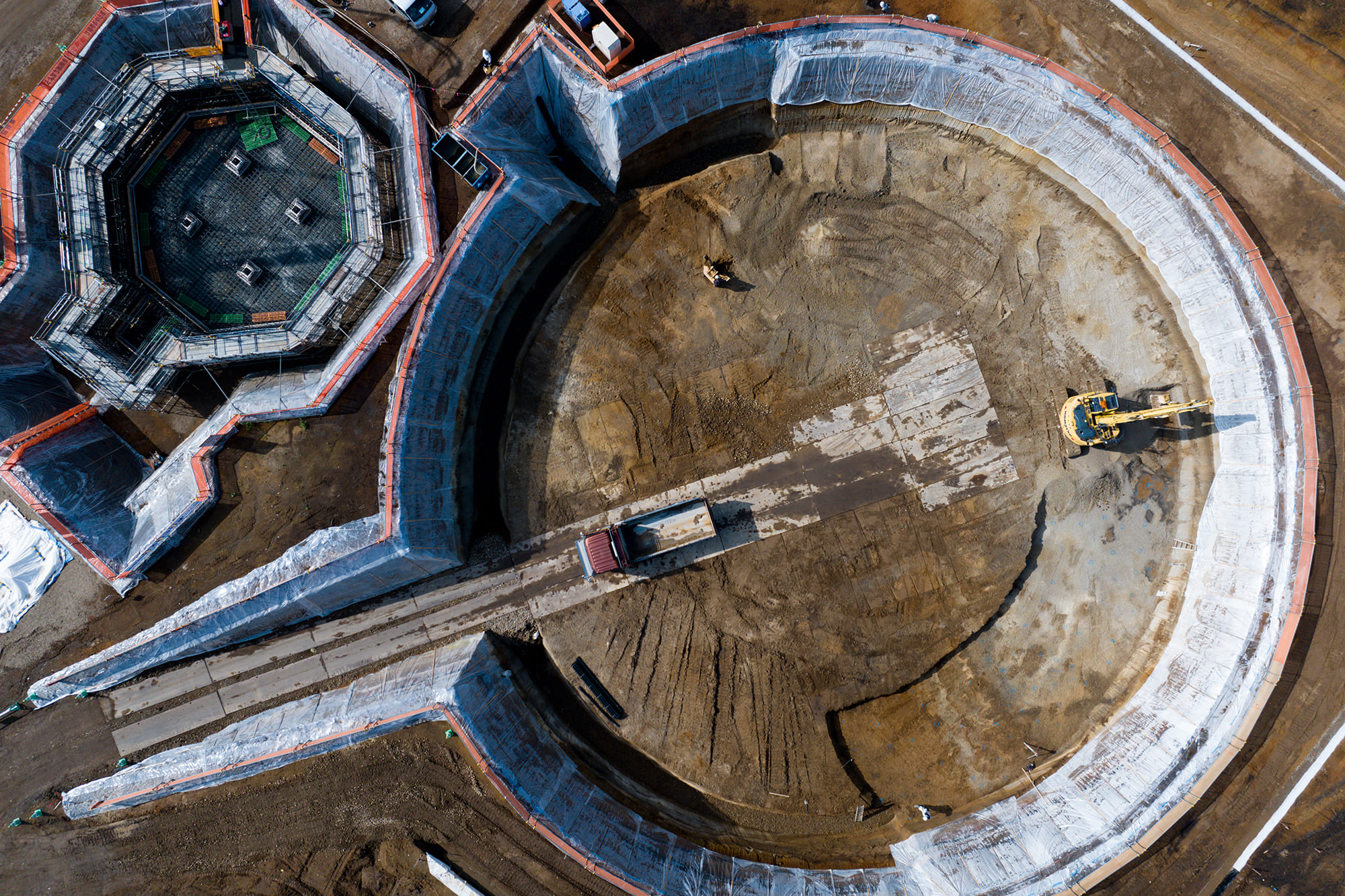
志を託され、二代目・上田光夫は幾多の荒波を越え、農業土木という根を深く伸ばしながら、企業としての形を築いていった。
そして令和元年、三代目・上田修平がそのバトンを受け継ぐ。
社是「夢と潤いのある理想環境の創造」を胸に未来を支えるための挑戦を迷わず進め続けている。
70年前、標津の大地を信じ、重機の鍵を回した瞬間から、上田組の未来は始まっていた。
今日もまた、私たちは誠実に、大地と向き合う。
地域の明日を創るために。
上へ、上へ
Shibetsu, Hokkaido.
In the 1940s, when plow horses still pressed their hooves into the earth, dairy farming in this land was standing at a major turning point.
More cattle, not enough feed—an unspoken anxiety spread across the region.
One man quietly ignited a flame of resolve.
The founder, Kagemitsu Ueda.
In 1954, with nothing more than a single piece of heavy machinery, Uedagumi began to move.
Running the machines day and night in rotating shifts, they carved new life into barren fields and pushed the future forward together with the community.
Perhaps in those days, it was not “technology” that moved the earth, but unwavering “conviction.”
Entrusted with the founder’s spirit, the second-generation leader, Mitsuo Ueda, steered the company through countless hardships—extending deep roots in agricultural civil engineering and shaping Uedagumi into a true enterprise.
In 2019, the baton passed to the third-generation leader, Shuhei Ueda.
With the company creed—“Creating an ideal environment filled with dreams and richness”—close to heart, he continues to advance boldly toward a future worth supporting.
The moment that first key turned in that lone machine 70 years ago, believing in the land of Shibetsu, the future of Uedagumi had already begun.
And today, once again, we stand with sincerity—face to face with the earth.
To shape tomorrow for our community.
Upward and onward.
上田組のあゆみ
- 1954
- 標津町川北に於て土建上田組(代表上田景光)として建設業の知事登録を受け創業
- 1965
- 株式会社上田組に組織変更資本金2,000,000円
- 1966
- 事務所兼上田会館完成
- 1967
- 釧路開発建設部工事参加
- 1969
- 三菱キャタピラーと提携、上田式フオーク完成
- 1970
- 砂利砕石プラント新設資本金15,000,000円に増資
- 1971
- 初代代表取締役上田景光死去 上田光夫代表取締役に就任、釧路支庁工事参加
- 1972
- 農用地開発公団新酪農村事業参加
- 1973
- 釧路営業所開設資本金20,000,000円に増資
- 1978
- 新社屋完成
- 1989
- 関連会社として建築資材を取り扱う商社㈲コスモス設立
- 1990
- 資本金35,000,000円に増資
- 2000
- lSO 9002(品質’94年版)認証取得
- 2004
- 上田光夫代表取締役、釧路建設協会会長に就任
- 2007
- lSO 014001(環境’04版)認証取得
- 2008
- 日本製紙㈱釧路工場内にペーパースラッジ灰を原料に骨材を製造/販売するEDB釧路事業所を開設
- 2009
- 埼玉県三郷市の大型商業施設「ららぽ一と新三郷」内に「標津いくら丼うえだ」を開店
- 2013
- 自社太陽光発電所(250KW)建設
- 2014
- 埼玉県入間市「三井アウトレットパーク」にいくら丼うえだ2号店オープン
- 2016
- ニュージーランドにて葡萄専心(株)と提携し葡萄栽培事業開始
- 2017
- 東京都銀座の大型商業施設「GINZA SIX」に「北海道UEDAGUMI」オープン
- 2019
- 上田修平が第三代上田組代表取締役に就任
- 2023
- 上田組社屋フルリフォーム完成/日経ニューオフィス奨励賞を受賞
私たちのロゴマークについて
私たちの歴史、想い、変わらぬ根本的な哲学をロゴマークへとアウトプットしました。
●築土構木
文明や文化が栄える前には必ず、生活基盤すなわちインフラストラクチャー(infrastructure)が媒介します。
冬は霜雪、雨露に耐えられず、夏は暑さや害虫に耐えられませんでした。
そこで、人々のために土を盛り材木を組み、室屋を作り、
棟木を高くし、軒を低くして雨風をしのぎ、寒暑や自然災害を避け、かくして人々は安心して暮らせるようになります。
つまり土木の語源とは「人々のために土を盛り材木を組み、安心して暮らせる基盤を生み出し、公に資する」こと。
安心して暮らせる「希望の光」とその発信元となる「エネルギー体」である太陽のイマジネーションを
デザインの源とし、太陽が一番目立ち、強調されることなく、あくまでも黒子の存在とした我々のメタファーを思案しました。
太陽は存在することが当たり前に捉えられていますが、もし陽の光が地球に降り注ぐことが無くなれば我々は生きていけません。
標津町の人々にとっての太陽。決して目立つ様なことはしないが、確実に人々の基盤を築いている私たち上田組の象徴を形取りました。
また、「上」の漢字の成り立ちを漢字考古学的に観察していくと指示文字という、
事態を抽象的に印であらわした字から成り立っており、上田組の根幹である名称形状のインスピレーションも織り交ぜながら構成しています。
さらに、右に向かってだんだん太くなっていく縦線の連続性は、企業の成長を表現し、決して途切れることのない永続性をも表現しております。
●24本の線
人々の生活を象徴づける数字として「24」からは切っても切れません。
1日は24時間。また季節も24節気と呼ばれ「人々の暮らしを支える」というコンセプトとも合致します。
数秘としても24は「現実的で計画的な行動により、皆が安定し、平和が保たれる」とされ、我々の信念をビジュアライズしたような数字です。
●色のこと
「UEDABLUE」という誠実で安定感のある色を思案しました。
青褐(あおかち)と呼ばれる和色をベースとし、褐(かち)=勝ちという縁起も担ぎ、
落ち着きを感じられる深みを持たせたオリジナルカラーです。
最後に、このアイデンティティは、我々上田組の信念・行動哲学と同じく、今も昔もそして未来も変わることのない、
普遍的なロゴマークになるよう想いを込め我々の道標としております。